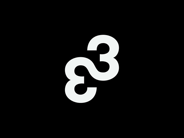
FL@33 LOGO (2004–TODAY)
When we set up FL@33 in July 2001 we did not have a logo for the studio. Instead we thought it's best to show our versatility and creativity by having different typefaces and custom lettering for different times and occasions. And so it started with our Ascii letterhead and envelope, followed by an animated version using our Unfolded typeface. Then we had an actual photo-based visual.
___ There is of course a certain logic and consistency in changing a design studio's logo ever so often but all these considerations were thrown over board when we created our next logo. We never really needed anything 'to make a mark' – especially not on a very small surface but the feet of our very own designer toy Mr Papillon were such a challenge.
___ The new symbol – two merged, flipped and turned 3s. Is it a snake? Two hearts? Two derrières? You'll never know. But we still use it today – after all those years – and the first time we printed it – it looked great on Mr Papillon's right foot. It was red and a mere 4mm high. The biggest we have seen it so far must have been about 2m high when it was projected on a massive screen during a FL@33 talk we gave in Barcelona in 2010.
___ Numerous type treatments and incarnations of the current FL@33 logo have since been created – some previews were added here – including a FL@33 Logo Cake, the logo as part of an Emoji Animation from 2016 or an animated glitch treatment for flat33.com's 404 Page Not Found error page.
RELATED PRESS
Logo, Revised Edition, The reference guide to symbols and logotypes, Laurence King Publishing, by Michael Evamy, London, UK, February 2021 (English)
Brilliant Logo – Logo design collection by motif, by BNN, 4 September 2017 (Japanese and partially English)
Logo (Mini Edition), Laurence King Publishing, by Michael Evamy, London, UK, February 2015 (English)
Grafik, 193, Letterform, selected by Tomi Vollauschek, London, UK, November 2011 (English)
Page / e-mag, page-online.de, FL@33 profile / interview, Hamburg, Germany, January 2011 (German)
Digital Arts, Creative Freedom feature, January 2011 issue, London, UK, December 2010 (English)
Designers’ Identities, FL@33 profile / case study, Laurence King Publishing, by Liz Farrelly, London, UK, November 2010 (English)
Computer Arts Project, 130, December issue, Underground Inspirations feature and Made & Sold review, London, UK, November 2009 (English)
Computer Arts, 159, Online Outlets, London, UK, March 2009 (English)
Babyboss, vol. 1, edition 4, bilingual, English and Indonesian, 12-page FL@33 profile / interview, Jakarta, Indonesia, September 2008 (English)
Digital Arts, May issue, Sell Your Designs, London, UK, April 2008 (English)
Logo, Laurence King Publishing, by Michael Evamy, London, UK, October 2007 (English)
Design in Europe 2007 / 08, Pyramyd Editions, Paris, France, October 2007 (English and French)
Hitspaper interviews (antenna7.com), by Arata Sasaki, Tokyo, Japan, August 2007 (English and Japanese)
Dpi, vol. 91, 10-page FL@33 profile / interview, Taipei City, Taiwan, November 2006 (Chinese and English)
New Graphic, issue 08, Jiangsu Fine Art Press, 12-page FL@33 profile / interview, Beijing, China, July 2006 (Chinese)
Design in Europe 2006, Pyramyd Editions, Paris, France, June 2006 (English and French)
+81, Plus Eighty One, vol. 32, summer 2006, 6-page FL@33 profile / interview, Tokyo, Japan, May 2006 (English and Japanese)
Computer Arts, 115, November issue, Expose yourself, FL@33 case study, London, UK, October 2005 (English)
Design & Designer 33 – FL@33, Pyramyd Editions, FL@33 monograph, Paris, France, May 2005 (English and French)
Design in Europe 2005, Pyramyd Editions, Paris, France, February 2005 (English and French)
RELATED NEWS
March 31st, 2021 — Now available to watch: The video recording of Royal College of Art (RCA) Zoom Webinar .A (point A) Graphic Reflections. The curated live-streamed video conference with selected Royal College of Art Alumni – including FL@33's Tomi Vollauschek – was organised in support of RCA 2020 graduates – and is now also available for all.
March 17th, 2021 — The revised edition of the logo design bible Logo: The reference guide to symbols and logotypes by Michael Evamy is now available with our publisher Laurence King Publishing. The new book includes nine FL@33-designed logos.
July 30th, 2020 — Royal College of Art (RCA) Zoom Webinar .A (point A) Graphic Reflections: A curated live-streamed video conference with selected Royal College of Art Alumni – including FL@33's Tomi Vollauschek – in support of RCA 2020 graduates.
July 1st, 2020 — Happy birthday FL@33! Today is our studio anniversary and we are moving to a new London address this week. Crazy times. It’s been 19 years already that FL@33 started its space odyssey in 2001! More info when this whirlwind is settling down a little...
June 14, 2019 — Check out our Instagram channel (@flat33studio) where we post observations, happy accidents, really beautiful things and also the odd ugly gem – all sorts of shenanigans in other words – and currently also ancient oddities from our work archive.
January 30th, 2019 — Evening lecture by Tomi Vollauschek as part of a 5-day FL@33 design residency at ECV Lille (École de Communication Visuelle / School of Visual Communication), France.
September 4th, 2017 — Brilliant Logo – Logo design collection by motif, by BNN in Japan is out now and includes 11 FL@33-designed logos.
February 27th, 2017 — Evening lecture by Tomi Vollauschek as part of a 5-day FL@33 design residency at ECV Bordeaux, France.
November 30th, 2016 — It's official: ECV Bordeaux, design residency 2017 – FL@33 workshops and lecture. More info.
September 9th, 2016 — Michael Evamy's book Logotype is now also available as Mini Edition featuring four FL@33-designed logos (Penrhyn Books, Weeks & Cowling, Arts Affaires, MMM-Festival). This completes Laurence King Publishing's Mini Edition book series Logo (bzzzpeek.com, Stereohype, FL@33, meubles.com, Toi Com Moi, Matelsom) and Symbol (École Normale de Musique de Paris, Toi Com Moi, Matelsom) and last but not least Logotype.
April 15th, 2016 — FL@33's Tomi Vollauschek is heading back to London tonight after an exciting week as designer in residence at the ECV Lille, France, where he ran a 4-day workshop and gave an evening lecture. See a documentation here.
April 12th, 2016 — FL@33's Tomi Vollauschek will give an evening lecture for students of ECV Lille as part of his design residency at the French college this week.
January 29th, 2015 — Out now: Logo (Mini Edition) by Michael Evamy also including six FL@33-designed logos (bzzzpeek.com, Stereohype, FL@33, meubles.com, Toi Com Moi, Matelsom).
August 21st, 2014 — Press release and invitation: Stereohype 2004–2014 — 10 years, 1,000 button badges, over 300 contributors, 1 exhibition, 10 specially commissioned posters (together with badge), several new product releases including B.I.O. (by invitation only) button badge series 14, call for entries for our 10th annual button badge design competition and more...
___ Please join us in London when we celebrate Stereohype's 10th anniversary – FL@33's experimental playground and international platform – with a huge exhibition. The private view will be on 18 Sep and the show will run from 13 Sep until – extended to 8 Nov (was 31 Oct). Please read the press release and invitation for all details.
August 8th, 2014 — Stereohype 2004–2014 — It's official as of today: FL@33's experimental playground and international platform for both emerging and established talents alike – Stereohype – will celebrate its 10th anniversary in style with an exhibition that will open its gate during London Design Festival 2014 and as part of '160' – a series of exhibitions hosted by the London College of Communication (LCC).
___ The FL@33-designed and curated show also marks the fact that Stereohype's popular button badge collection, created by over 300 contributors, will reach its 1,000th button badge this September, with each badge being showcased including an anniversary poster and badge project specially commissioned for the occasion. Preparations are in full swing and the official press release and invitation will be posted soon.
___ Sat 13 September – extended to Sat 8 November (was Fri 31 October), Mon–Fri 10am–5pm, Sat 11am–4pm, closed Sunday. Private View: Thu 18 September 6–9pm Hope to see you there. #st10yrs #lcc160 #ldf14
___ Location: Lower Street Gallery, London College of Communication, Elephant and Castle, London SE1 6SB
November 7th, 2012 — Our contributor copy just in. FL@33-designed logos featured in latest Laurence King Publishing publication by Michael Evamy. Following the author's earlier book called Logo that featured six FL@33-designed logos (bzzzpeek.com, Stereohype, FL@33, meubles.com, Toi Com Moi and Matelsom) he now selected for his book Logotype four more recent FL@33-designed logos developed for Weeks & Cowling, Arts Affaires, MMM-Festival and Penrhyn Books. We posted snapshots of Logotype here and also on FL@33's Facebook page.