PRESS ARCHIVE
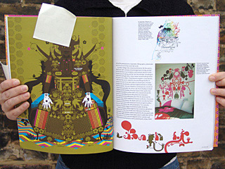
Eye, 58, winter issue, The Discriminalisation of Ornament, with Stereohype Squirrel motif as part of the feature article by Alice Twemlow, editorial and p.27, London, UK, winter 2005 / 06 (English)
___

EYE | THE DECRIMINALISATION OF ORNAMENT
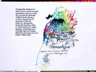
(...) Visual identity for online boutique, stereohype.com, including logo and modular illustration with squirrel motif. Design: FL@33, 2004. (...)
EXCERPT
(...) In which tendrils creep, petals unfurl and geometric patterns abound Matter, a small design and homewares store in Brooklyn, has a logo that is able to change so that, according to Jamie Gray, the store owner, it will always ‘reflect the times’. Right now this adaptable logo is an ornate graphic flourish. At the centre of the heraldic device...
(...) CONTINUE READING
...is the store’s initial letter with a crown hovering above it and its address in a slanted spidery script dangling below. Symmetrically arranged around the central medallion are gothic-looking sprays of feathers and some looping vine tendrils that evoke the fluid calligraphic line found in Art Nouveau wrought ironwork.
___ Ornament is clearly an integral part of the dominant visual language of the moment. The extent to which it has resonated with the public at large can be judged by the ubiquitous presence in the homes of Habitat-shoppers of the Toord Boontje filigree light shade. In Copenhagen, an entire hotel was redesigned from the inside out, as part of a Volkswagen-sponsored initiative called Project Fox. The carpets, wallpaper and furniture now teem with the kaleidoscopic explosions and fantasy pattern-scapes created by a group of designers and illustrators selected by the trend-conscious Berlin-based design publishers Die Gestalten. In Barcelona, too, the Maxalot Gallery has commissioned designers such as Hideki Inaba, Joshua Davis, eBoy and Rinzen to create a collection of wallpaper designs that, as they put it, ‘celebrates the re-birth of wallpaper’.
___ Dense patterns multiply and foliage unfurls across computer screens, fuelled partly by improvements in Flash-based technologies. Mobile phone users can paper their tiny screens with a Geneviève Gauckler or a Laurent Fétis design commissioned by companies such as Yakuta Mobile Visuals.
___ In the past few years the pages we turn, the screens we summon, and the environments we visit are sprouting with decorative detail, geometric patterns, mandalas, fleurons, and the exploratory tendrils of lush flora. In a design climate that, for the larger part of a century, has been famously hostile to the generation, application or even mention of decoration, what has happened to allow for this decriminalisation of ornament discernible in today’s design practice and thinking? And, beyond the palpable trendiness of these recent reinvestigations, what is its deeper significance?
___ In which we follow the fluctuations of ornamentation’s fortunes, from good to bad and back to good again, possibly Ornament has had a turbulent past. For a considerable part of the past two centuries, ornament has been the subject of debate in design, at least as it related to buildings and their interiors. In the mid-nineteenth century, discussion focused on the meaning of decoration, its classification and its most appropriate uses and sources. The roles of nature, history and sources from outside Europe were all hotly contested. The development of machine-made decorative detail further complicated the debate. As ornamentation became a more affordable and thus widely available feature of everyday household items such as textiles, wallpapers, books, cups and saucers, so the discourse that surrounded it began to take on a more moral, social and even political tone. It became inextricably bound up in discussions of beauty and taste.
___By the time of the Great Exhibition in 1851 – an event where the objects on display were, according to architectural historian Brent C. Brolin, ‘covered with clouds of putti, acres of acanthus, and cornucopiate harvests from the vegetable kingdom’ – ornament was in disgrace with the taste-making cognoscenti. There followed attempts to tame and codify decoration. The most famous and enduring of these was the architect Owen Jones’s didactic Grammar of Ornament, published in 1856, which laid out 37 propositions relating to the appropriate uses of decoration and pattern and showcased in brilliant colour (made possible by the recent introduction of chromolithography) thousands of examples of ornament from around the world. Owens believed that, ‘All ornament should be based on geometrical construction,’ and gave very detailed instructions concerning the use and placement of colours and hues. He forbade the use of ‘flowers or other natural objects’ unless they were ‘conventional representations (...) sufficiently suggestive to convey the intended images to the mind, without destroying the unity of the object they are employed to decorate.’ Such passionate commitment to the cause of using ornamentation correctly was not uncommon in this mid-nineteenth century period of design reform. John Ruskin’s writings about ornament were also shot through with similar concerns. And the moral tone of the critiques was further honed in the early twentieth century by the belief among avant-garde circles that products that disguised their modes of construction with ornament were dishonest and, therefore, fundamentally flawed. The moral resistance to ornamentation found its most vehement spokesperson in Austrian architect Adolf Loos, who in 1908 published a diatribe against decoration, titled ‘Ornament and Crime’. In this text Loos uses stirring rhetoric to argue that cultural evolution and human progress was being hampered by ornament. In his view, ornament was a waste of manpower, health, materials and capital. ‘In a highly productive nation,’ he wrote, ‘ornament is no longer a natural product of its culture, and therefore represents backwardness or even a degenerative tendency.’
___ The social and economic import of such beliefs fuelled Modernism’s manifestos, teachings and practice. Ornament continued its long fall out of favour in architecture, industrial design and graphic design for the better part of the twentieth century. With postmodernism’s revivification of complexity, lent legitimacy by Robert Venturi’s writings in the 1960s and 1970s, ornament was granted a reprieve among design thinkers and makers. Even so, ornament has found it hard to shake its second-tier status within the cultural spectrum. It shared this space beyond the pale with the crafts, outsider art, popular or commercial art, and other obsessive or naïve creations such as the kinds of work depicted in Margaret Lambert and Enid Marx’s English Popular and Traditional Arts published in 1946 which showcased examples of indigenous crafts such as hand-painted fairground signage, canal boat decoration, intricate lacework and straw dolls.
___ And, even today, despite its proliferation and the slow emergence of discourse surrounding it, the use of decoration is still regarded by mainstream graphic design as taboo – a testimony, perhaps, to Modernism’s enduring hegemony. A discussion about decoration on the design blog Speak Up, for example, saw the terms ‘candy’, ‘craving’, ‘fluff’, ‘indulge’, ‘eighth deadly sin’, ‘closet’, and ‘guilt’ (...)


