WEEKS & COWLING | WEBSITE (v.2)
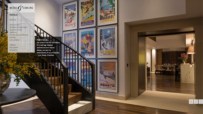
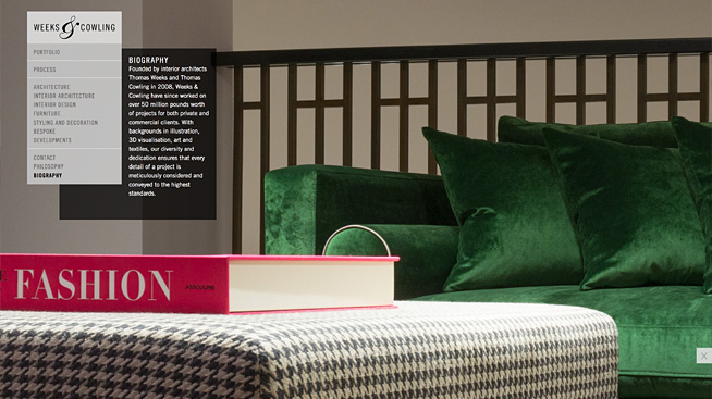
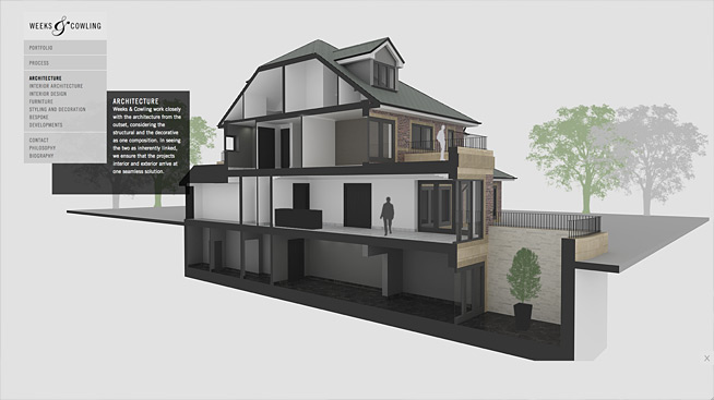
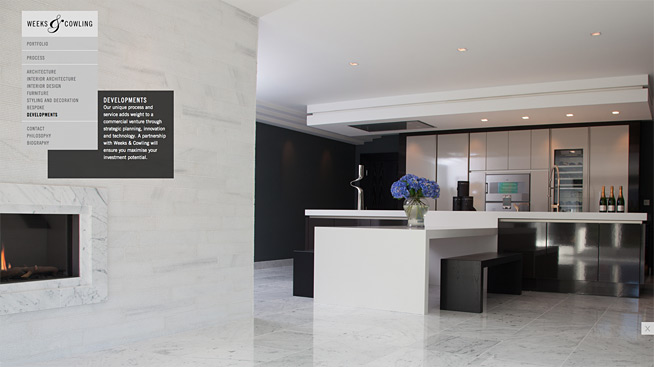
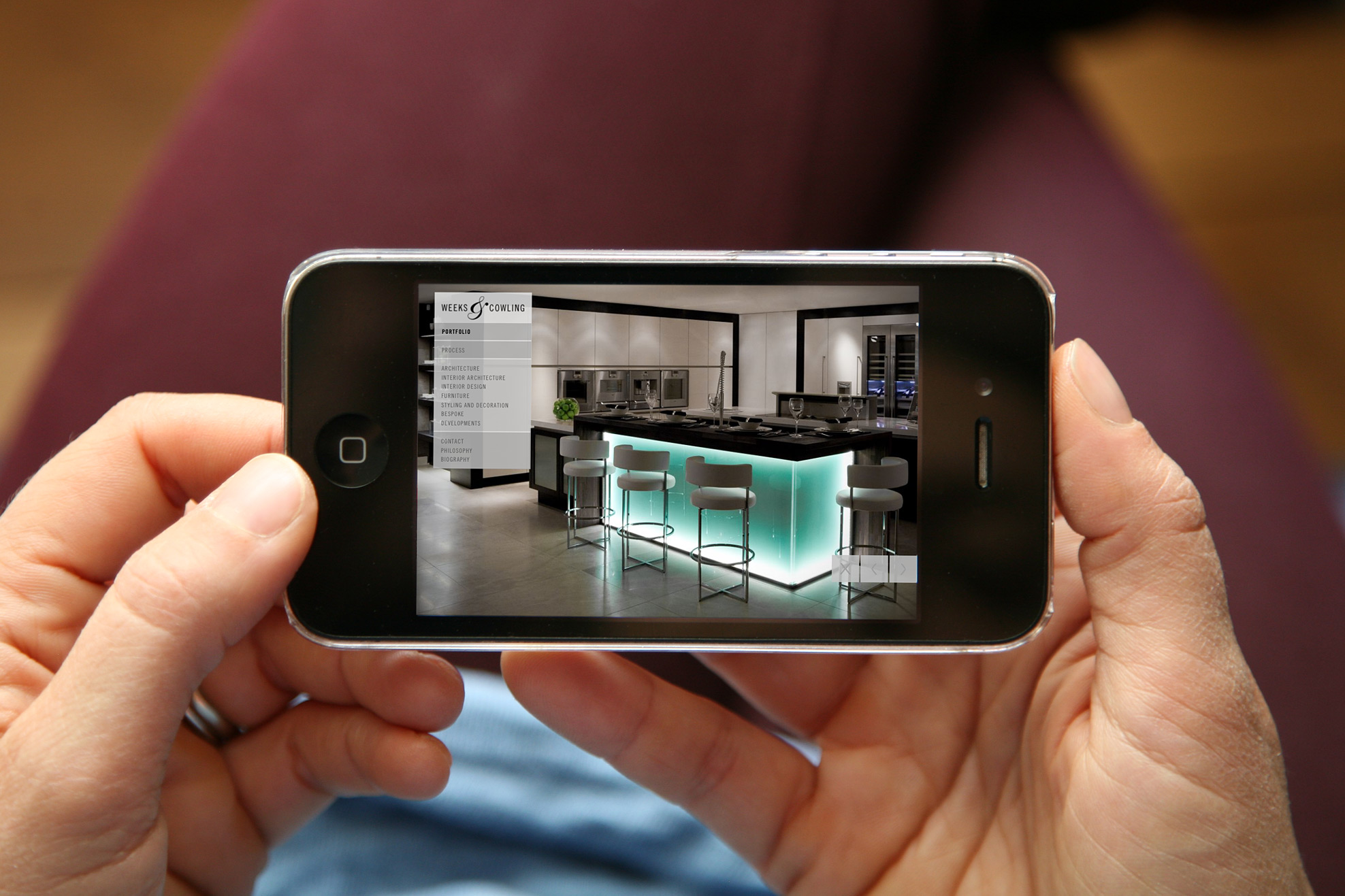
UK-based Interior and Architectural Design Studio Weeks & Cowling recommissioned FL@33 to create the second version of their portfolio website. It was designed, developed, coded and fine-tuned throughout the year and is now live.
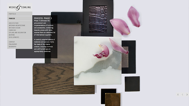
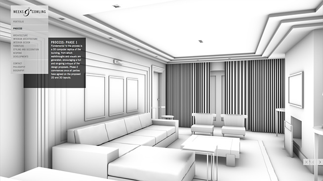
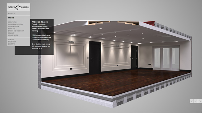
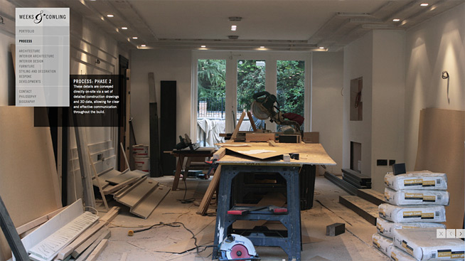
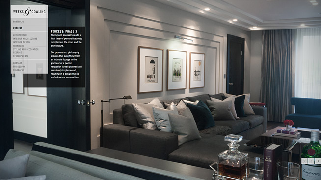
___ The responsive website was optimised for the latest browsers and touchscreen versions for iPhones and iPads alike.
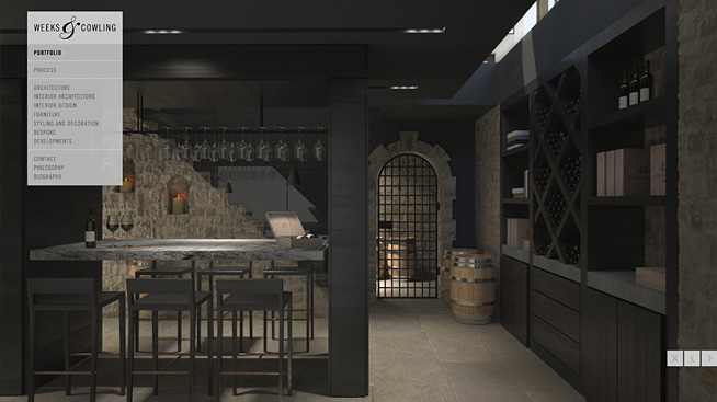
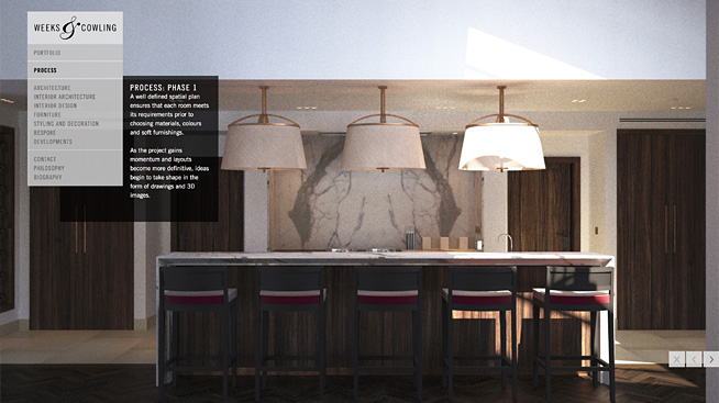
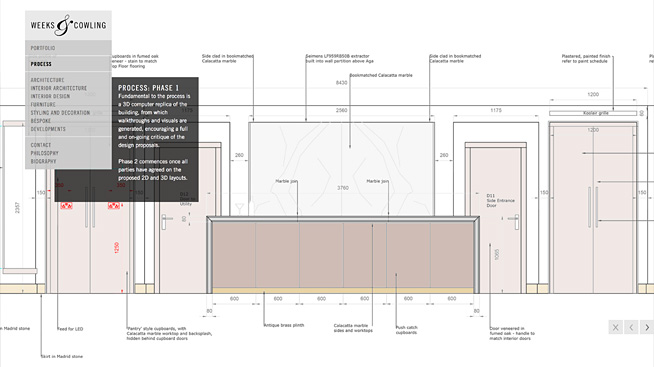
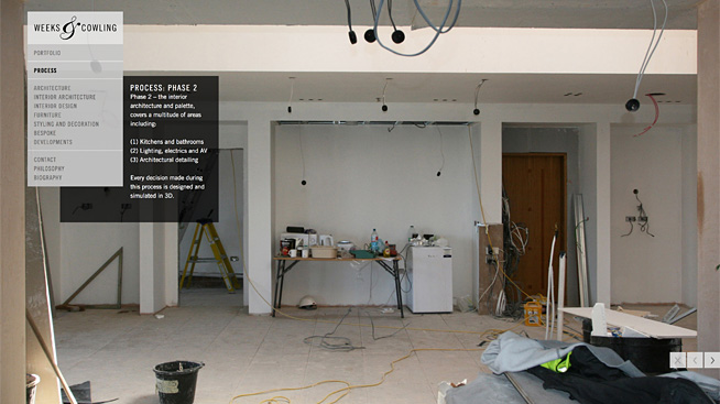
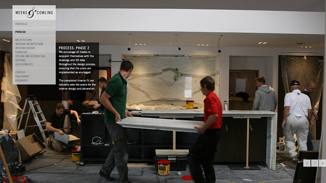
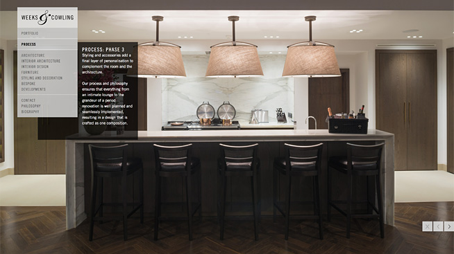
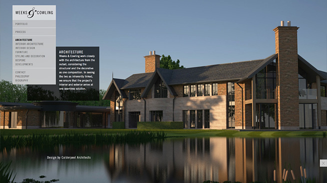
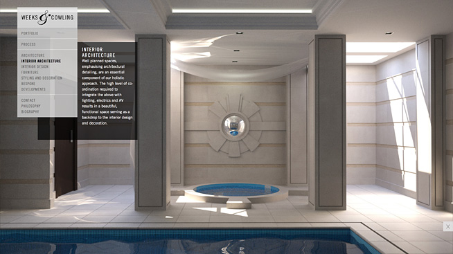
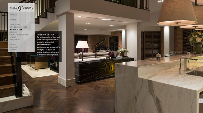
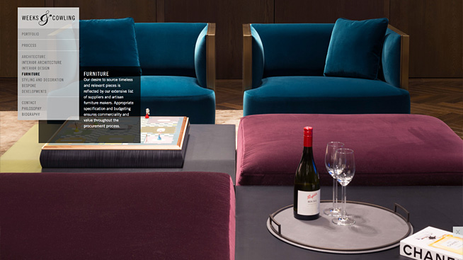
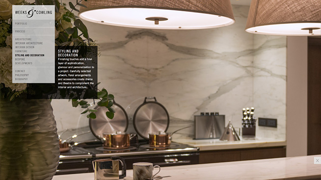
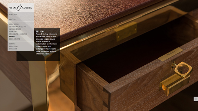
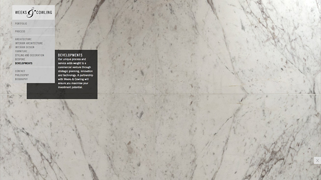
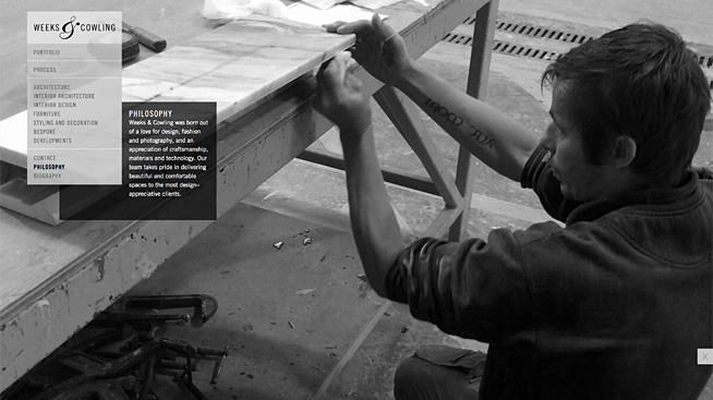
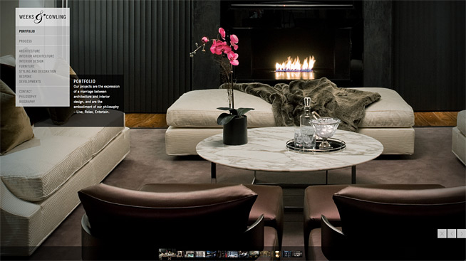
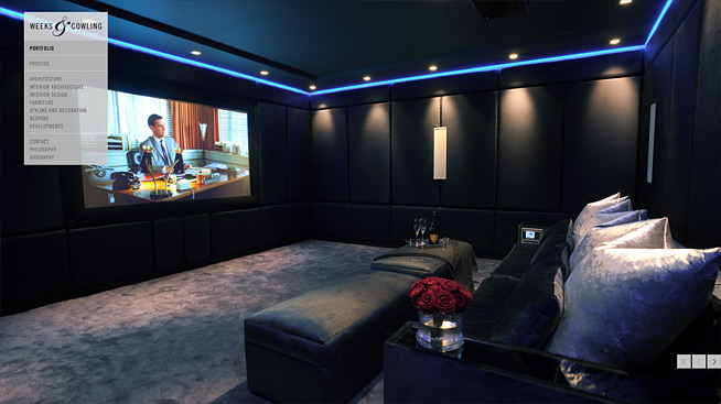
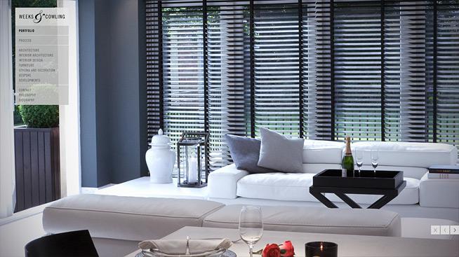
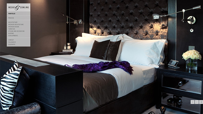
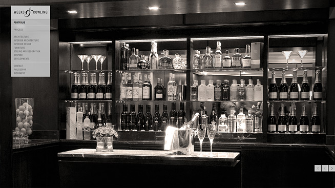
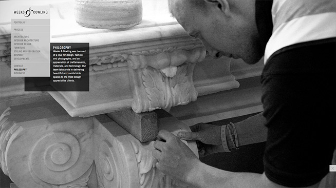
___ FL@33 also consulted Weeks & Cowling on the use of pictures that now form an increasingly important and integrated part of their evolving visual identity.
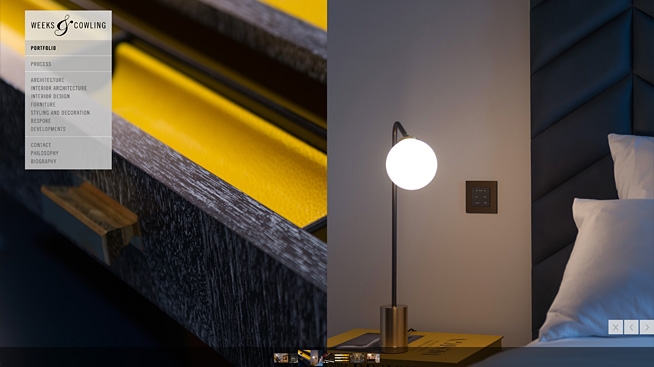
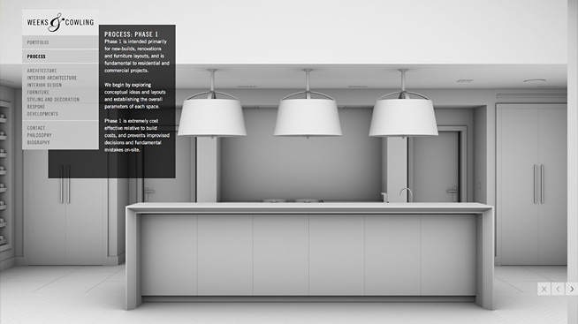
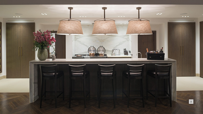
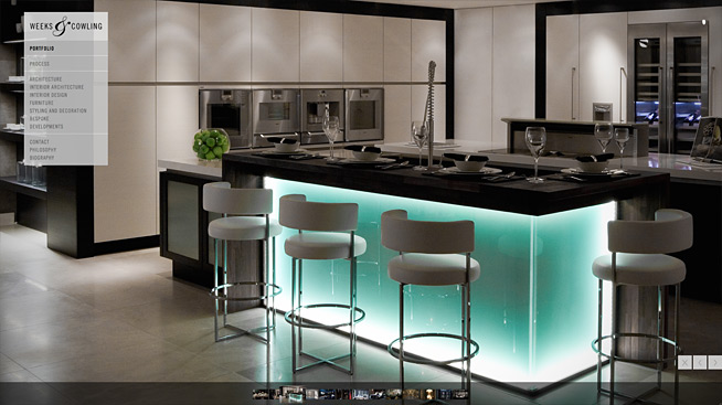
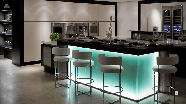
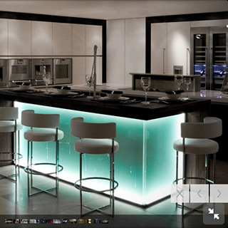
___ The interface features an 'X' button that allows the user to hide everything but the picture. Menu, texts and navigation disappear to allow focusing on the picture. A thumbnail bar navigation was especially developed with computer displays in mind. This navigation bar slides in from the bottom edge in both – Weeks & Cowling's Portfolio and Process sections to add a second way to navigate through these two main areas of the website. Previous and next buttons are offered there as an alternative navigation.
___ Touchscreen versions of this website do allow the user to swiftly swipe through the slideshow while the computer display version features smooth picture transitions instead.
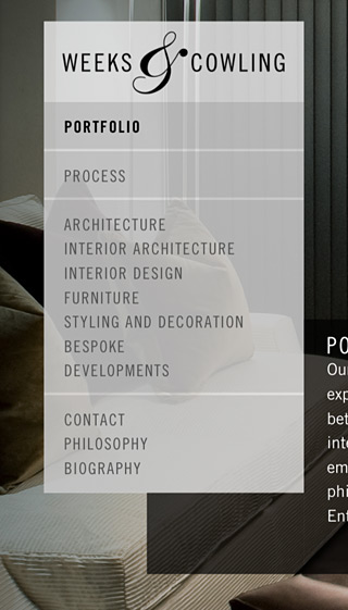
___ The website was designed using webfonts of the studio's identity typeface Trade Gothic condensed normal and bold.
WEBSITE CODE | CUSTOM CMS
The website was designed by FL@33 and coded by our trusted programmers Huck und Fresow. The website was handed over to the client with a bespoke content management system and a crash course to update by themselves – with our guidance whenever needed.
WEEKS & COWLING IDENTITY
Weeks & Cowling's visual identity has steadily been evolving ever since FL@33 designed their logo, a logo animation, their first set of business cards, version 1 of their website – followed by their latest business cards and version 2 of their website five years after.
Categories: Logos | Identities, Screen, Typography, Websites | Digital
Sectors: Architecture | Interiors
