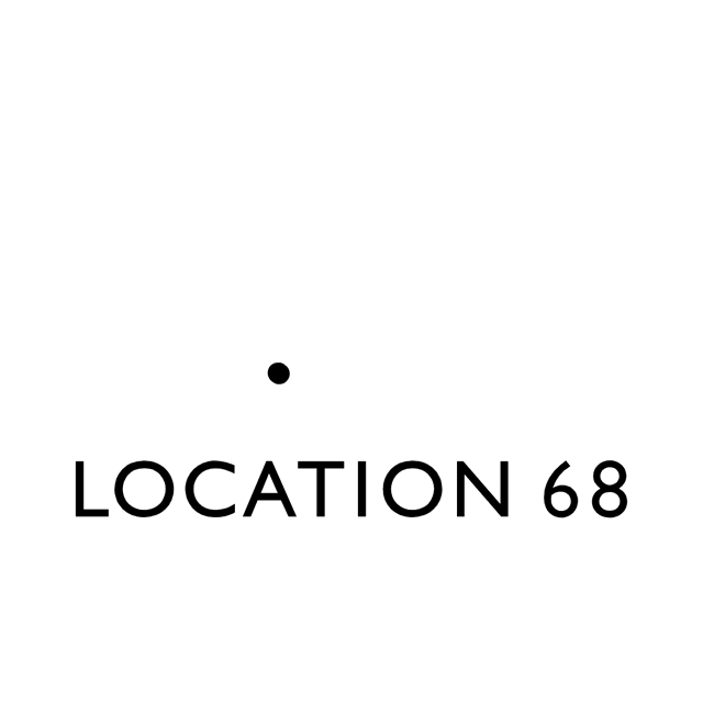
LOCATION 68 | LOGO
This strikingly minimal and memorable logo was patiently developed by FL@33's Tomi Vollauschek for UK-based Location 68 – a new consultancy for Bespoke Golfing Experiences.
VISUAL IDENTITY | BRIEF
The brief was to create a sophisticated, versatile logo and visual identity that is appropriately elegant, contemporary – yet timeless – and that helps Location 68 to communicate their luxurious bespoke services with the right tone of voice for their demanding clients.
___ The logo was also applied to stationery designs including digital letterhead templates and elegant printed business cards.
___ A brand-new Location 68 website that FL@33 developed in tandem was also just launched and proudly features the new logo, too.
LOGO DESIGN | CONCEPT
FL@33 created a symbol / logotype combination for Location 68 so that the compact symbol can also be used alone – without the company name – ideal for social media profile avatars and for embossing or wax seals.
___ The symbol is showing a subtle number 68 that does not interfere with the company name that also features these numbers below. The symbol was developed using only 4 circles restricted to two sizes – resulting in a subtle association with golfballs in a hole or bucket.
___ For the logotype the very suitable Gill Sans MT Pro Medium was selected because of the typeface's geometric shapes and constructed characteristics such as the wide and particularly circular letterforms C and the O's. The numbers 6 and 8 however make this typeface a perfect match. The number 6 has a very similar curve at the top and the number 8 is made of two identically sized circles – mirroring the symmetrical aesthetic of the constructed numbers within the logo's symbol.
___ The original numerals from Gill Sans MT Pro Medium are used here – but their weight and size were customised for increased harmony.
Categories: Campaigns, Logos | Identities, Moving image, Print, Typography, Websites | Digital
Sectors: Others, Sport | Leisure