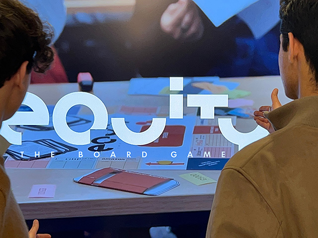
EQUITY | START-UP | FOSTERING RESPONSIBLE FINANCE | THE BOARD GAME
FL@33's Tomi Vollauschek collaborates with the start-up Equity on all key aspects of visual communication for its evolving identity system. Tomi also contributes to the design and product development of their educational board game. To date, we have created a bespoke logotype, a logo animation, and the latest iterations of the board game prototype #5 designs.
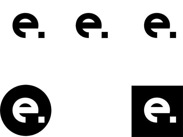
EQUITY | THE LOGO
This playfully geometric logo was developed by FL@33's Tomi Vollauschek for Equity and its educational board game.
___ The minimal custom typeface and logotype design were combined with the tagline's Futura Maxi and its wide and particularly geometric letterforms. Taglines such as the initial 'The Board Game' feature in various type sizes relative to the logotype. This enhances overall legibility across different size applications.
___ The board game itself is very colourful, and we kept the logo in black and white to contrast this. Consequently, the logo appears not only modern and clean but also calm, confident, and visible against a sea of colours.
___ As Equity evolved over time, we introduced additional taglines to the visual identity family, including 'Fostering Responsible Finance', 'The Prototype' and individual locations of the various Equity teams around the world including Turin, Paris, Hong Kong, Milan and Berlin.
EQUITY | DESIGN INSPIRATION | IDENTITY SYSTEM | PAC-MAN
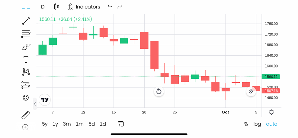
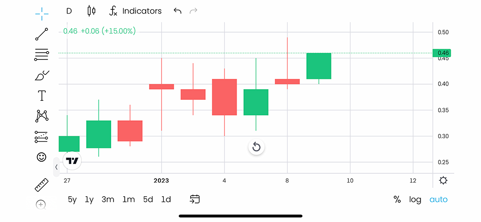
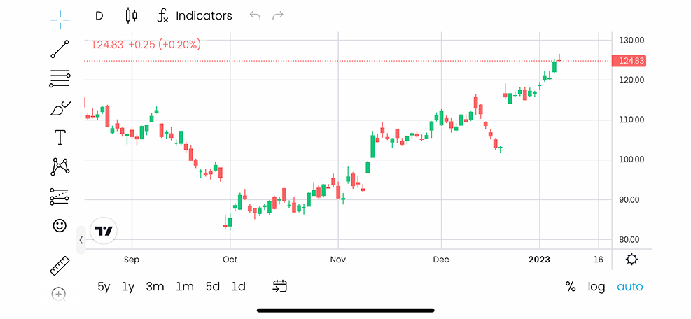
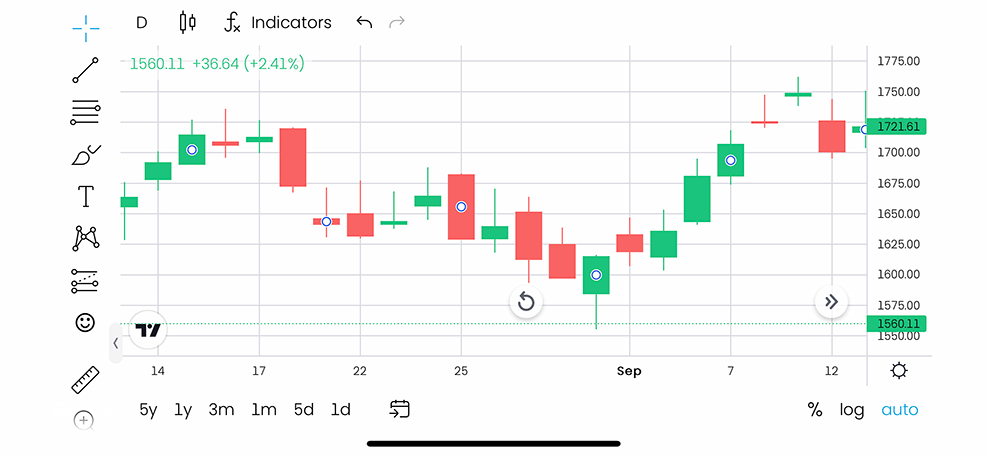
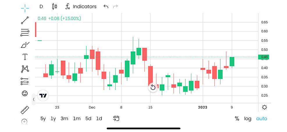
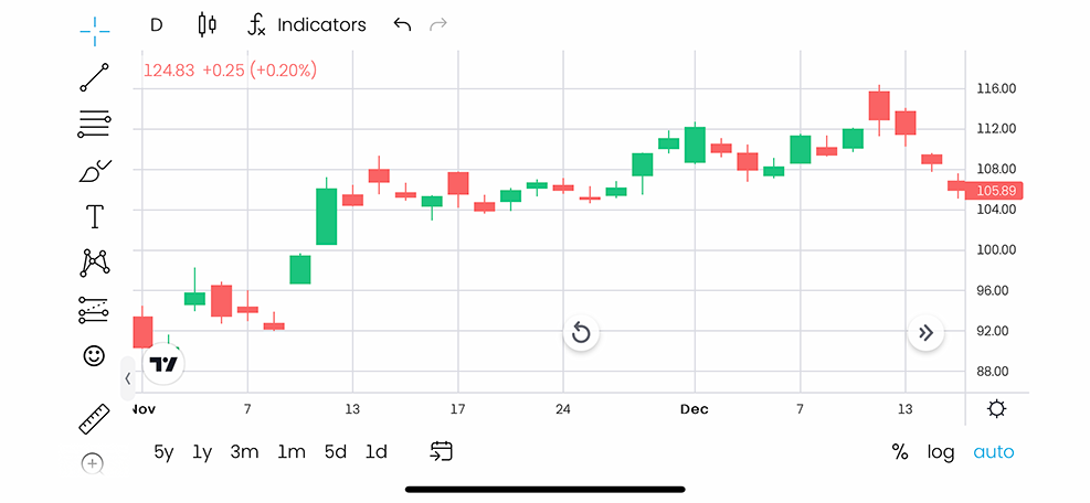
The bespoke Equity logotype design is based on ideas of so-called stock market bar and candlestick charts – visualisation graphs depicting value fluctuations over time (see slideshow further down on this page for examples).
___ Trading principles also visually informed the logo creation. Associations of a puzzle or, more precisely, a modular system were incorporated – graphically cutting away elements that are added elsewhere. Similar to diversified investments being moved and adjusted.
___ The logotype is a centrepiece of a carefully considered modular and still evolving visual identity toolbox. A first glimpse into what will be the starting point for a flexible identity system. The game's prototypes are currently already in very advanced playtesting and fine-tuning stages.
___ The social media avatar is the profile picture shortform letter 'e.' that subtly reminds us of a hungry retro video game character, Pac-Man, chasing a dot – adding subtly to the overall playfulness.
EQUITY | THE LOGO ANIMATION
As described in the design inspiration section above, the custom letterforms of the logotype convey brand attributes through their shapes, proportions, and stylistic details.
___ The animation further enhances and visualises this as Equity's letters are cut, halved, and multiplied – like investments. These characteristics of growth principles are communicated even clearer in the animation that is used across social media channels and during workshops and playtesting events.
EQUITY | THE BOARD GAME
The official – slightly edited Equity synopsis:
___ Fusing pedagogy, realism and gameplay to promote financial literacy founded on environmental and social responsibility.
___ Equity has the mission to make responsible financial literacy more inclusive and accessible. The Equity team is developing a pedagogical board game through which players discover the power of financial markets by competing to build the most profitable and responsible investment portfolios. The board game encourages our values of social and environmental responsibility as a framework for investing and managing money.
___ The board game's idea was inspired by Bourse: Le Jeu de la Finance, a Serious Game produced in 1976 by Editions Fenwick and developed by French academic and economist Bertrand Jacquillat. Discovering Bourse let the Equity co-founders to consider the importance of gameplay in education, setting off the journey towards equity.
Categories: Logos | Identities, Print, Typography
Sectors: Education, Others, Publishing, Retail