PRESS ARCHIVE
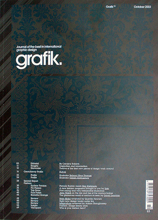
Grafik (formerly Graphics International), 110, by Liz Brown, 6-page FL@33 profile / interview, Consultancy Profile, featuring various FL@33 works, pp.16–21, London, UK, October 2003 (English)
download pdf of published version, approx. 0.5mb
___
GRAFIK | FL@33 CONSULTANCY PROFILE (UNEDITED VERSION)
If Agathe Jacquillat, one half of FL@33, had grown up in Britain she might have allowed her fate to be decided by a careers advisor. Luckily she grew up in France, and went to see a graphologist. “I was 18 years old,” Jacquillat remembers, “it was after my baccalaureate and I didn’t know what I wanted to do. So I saw a graphologist. After the end of the first interview she said, ‘You like art, don’t you?’, and apparently I had this big smile on my face and she told me I should study graphic design in Paris. And so I did.” Jacquillat, now 28, graduated from the Academy Julian in Paris, and then went onto the RCA (via a summer session at the Rhode Island School of Design in New York, and internships at Young & Rubicam Paris, Dazed & Confused and Pentagram).
___ In contrast, her partner at FL@33, Tomi Vollauschek, 30, was taking drawing classes in his native Frankfurt at the age of nine. “I went into the equivalent of A Levels in Germany with a graphic design background,” he laughs. He had a design degree from FH Darmstadt and spent a semester at Camberwell College before going to the RCA, where the pair met in 1999. They graduated in 2001 and launched FL@33 during their final year show.
___ Aside from wanting to learn more about graphic design, the other aim was to use the RCA experience to help them launch their own company. “I realised that the RCA was useful to propel yourself into the design world,” Jacquillat says, with sense of purpose that more than compensates for her earlier lack of direction. “I wanted to set up my business and I wanted to find somebody to set it up with me.” Vollauschek agrees: “We both wanted to meet somebody as focused as we each were.”
___ To this end, they completed two projects by the time they graduated that would go on to win them prizes, clients and admirers all over the world, and creating what Vollauschek calls the FL@33 “chain reaction” effect.
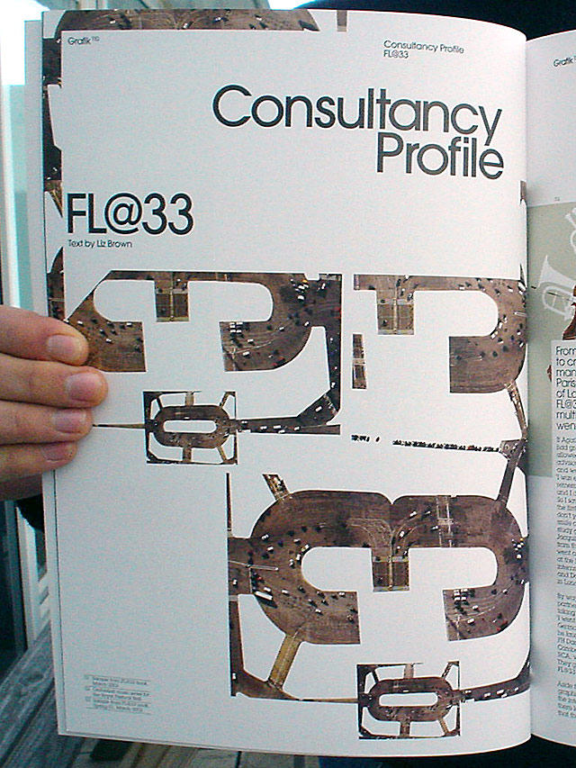
___ The project for which they are most famous was inspired by the view from the window of their Notting Hill studio. “We wanted to do something that didn’t involve moving too much,” Vollauschek explains (although this was later to backfire). Trans-form is a multi-media celebration of the tower cranes that dominated the Paddington skyline until earlier this year – there is now only one remaining and the view looks empty.
___ “The main challenge was to bring together three different kinds of media,” Vollauschek says. “Usually that’s not our starting point, but in this case...
(...) CONTINUE READING
...it worked quite well. Normally we come up with an idea rather than a presentation environment, but in this case that’s how it started.” The finished project includes a magazine, Trans-form, a website, trans-port.org, and a CD-Rom, Trans-it, and it was to become a blueprint for the way that FL@33 was to develop, work and think.
___ The company has an impressive output, given that it has been running for just over two years, that it is very much multi-media in its output, and that all work is completed by the two of them. Trans-form includes Armin Linke-style window reflection photographs, line drawings, photo montages, typography and graphics; Monty Pythonesque crane insects scuttle around in the CD-Rom animations; and the website offers the opportunity to climb into a tower crane cab, facilitated by a 30-metre vertical trip Vollauschek took with his camera: “We have a couple of friends who are architects, who allowed us access to construction sites. I ended up on a crane in Frankfurt. It was quite scary – I don’t like heights.”
___ Half of Trans-form’s UK stockists have sold out but it is still on sale at Tate Modern and Zwemmer and is available online from flat33.com.
___ The second RCA project that helped propel them, as Jacquillat would say, into the world of design was their animation Singing Pasta or Eat and Be Eaten. As you might guess from the names, it’s a short animation that features two pieces of pasta that ‘sing’ and then one eats the other at the end. It’s a gem, and, along with the Animated Acoustic Typefaces, won them a multimedia competition organised by Noos Interactive Television in France, and a tidy sum in prize money.
___ The chain reactions duly began: the head of design at the Royal Festival Hall sees Trans-form and convinces his marketing department that FL@33 can do for classical music what they did for tower cranes, calls and commissions a series of artworks for the RFH’s Classical Music Campaign. Trans-form is featured in Laurence King’s book GB: Graphic Britain and FL@33’s posters Pencil Eye and Butterfly Sculpture (designed for the occasion) are shown at the launch exhibition at Magma. Creative Review includes the posters in a feature on GB: Graphic Britain and asks FL@33 to design the cover to celebrate the D&AD’s 40th birthday. Montse and Marc of Magma see the posters and invite FL@33 to participate in the first edition of their magazine, Graphic. And MTV sees the Creative Review cover and calls to ask if they do moving image work (the resulting VH1 animations, some of which are shown here prior to launch, are due to air in the autumn).
___ This is not to say that Jacquillat and Vollauschek clone their ideas and pass them from one client to another. Each piece of work is often unrecognisable in style to the last – and the pair enjoy surprising their clients. Montse and Marc might have been expecting pencils, “but we wanted to show a different area and we wanted to make photography,” Jacquillat says. “It’s nice to leave the computer once in a while.”
___ “We’d just come back from Budapest with a huge series of photos,” Vollauschek adds. “And it came directly after some animation work, which was all on computer.” The animation was 335 frames of ASCII for architect Will Alsop, who had seen Trans-form and invited them to take part in an exhibition he was curating at the 2003 Bienal de Valencia.
___ Projects and works also develop as relationships with clients develop. FL@33 has been working with French mattress company, Matelsom, since 2001. “At the beginning we were just asked to make one poster,” Vollauschek says. “We said ‘why don’t you make two? Then it would be a campaign,’ but there wasn’t the budget. So we developed a concept that worked with one but that would have been better with two – and in the end they made two. And the next year they said, ‘now we are going to make four’.” The posters are on every Paris Metro train for the next year.
___ As well as going on to design Matelsom’s website, logo and typeface, FL@33 also created a series of business cards for the company’s employees. These include a picture of each person’s favourite sleeping position, and resulted in another little chain reaction: a survey on the Matelsom website to find the favourite sleeping position in France. “We’ll find out the result in a couple of months,” Vollauschek says.
___ Even though the pair work with a large array of different formats – everything from Director and Flash animations to photography, to typography, to drawings or graphics, to scissors and paper – the work and ideas are never burdened by their final format, but liberated by it. FL@33 are the masters not the servants of their machinery, as is suggested by Vollauschek’s earlier comment about the format being chosen last. They develop all concepts together, and then the ‘formatting’ tasks are divided: “At some point we had to decide who’s doing all the html stuff”,” Vollauschek begins, “And as I’d come to the RCA to learn how to make websites, that was me,” Jacquillat interjects. Vollauschek returns: “And if it’s more illustrative, in terms of hand-made, it’s Agathe’s work, and if it’s slightly more techy in terms of animation, then it’s mine. So I do all the timelines,” he smiles. “Sometimes we have to really specialise within the team but other times we do similar work and have similar strengths.” “And then it depends how much time we have,” Jacquillat says.
___ Last year they found time to launch bzzzpeek.com, their onomatopoeic online experiment. “It started about two years ago when we began to write down sounds that we remembered from our childhood,” Vollauschek explains. Jacquillat adds: “Tomi’s Austrian and I’m French and we’d see a rooster: in French the rooster goes ‘cocorico’, and in German ‘kickeriki’”. And the English version is completely surreal.
___ The website is made up of line-drawn animals. You click on one, and then click again on the various country flags to hear the onomatopoeic sound representing them in various languages (13 so far). “The snake’s sound is quite amusing,” Vollauschek comments. “In Japanese it’s something really weird.” “It was friends of family first, then their friends who contributed sounds,” Jacquillat explains. “Then I started asking local people if they knew any children..,” she laughs. “We ended up in a hotel in Victoria and the Indian woman at reception called some friends in Pakistan and this little boy did a recording for us.”
With no more spare time to promote the site, they sent it off to a couple of competitions (including Ars Electronica in Austria, which awarded it an Honorary Mention, and the ADCNY, which gave it a Distinctive Merit Award) and portals like DesignIsKinky. The site averages roughly 2,000 unique visitors a day (after peaking at 10,000).
___ “We’ve had a good response from educational establishments asking if they can use the application, because the website is designed to be used by everybody – for kids as well. So once they are in the application, they should be able to use the menu icons to help them find the sounds. And we’ve seen kids of two and three using it,” Vollauschek says.
___ October looks to be another busy month for the pair. Their own website, which they have not had time to update since the company’s early days, is due to re-launch and will include a comprehensive archive of work. They are also participants in a book, Romantik, which is due to be published this month by Die Gestalten Verlag, and which has meant another short break from the computer and more illustrative work from Jacquillat and filmed work by Vollauschek.
___ As well as working on their latest self-initiated project, a book of their own work (for which they are seeking a publisher), there are deadlines for clients, too, including a website for French furniture company, meubles.com. I wondered which of their international clients were the strictest when it came to keeping to deadlines. “I’d say it was between Germany and France,” Jacquillat decides. “It’s a cliché, but I’d say that the Germans are the strictest,” Vollauschek agrees. “I’m not sure about the towel story but the deadline thing’s right.”
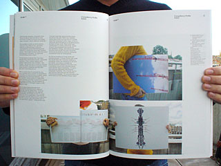
CAPTIONS
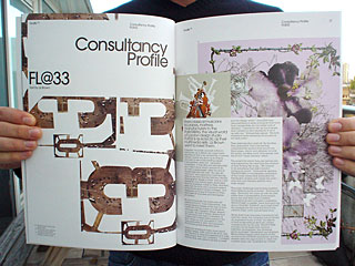
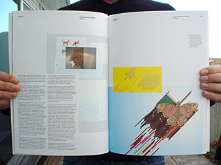
|01| Sample from FL@33 book, March 2003 |02| Orchestral music series for the Royal Festival Hall |03| Sample from FL@33 book, Spring 01, March 2003 |04| FL@33 stationery with postcard Cityscape Metamorphosis, June 2001 |05| Artwork for Creative Review cover, 40 Years of D&AD, November 2002. Art direction Nathan Gale. |06| Pencil sculpture illustration series, Butterfly Sculpture, contains 818 pencils, September 2002 |07| Trans-form, Trans-it, trans-port.org magazine cover, July 2001 |08| Creative Review editorial design, Miami Ad School, May 2003 |09| Cityscape Insect, spread from Trans-form magazine, July 2001 |+| FL@33, 27 Hereford Road, London W2 4TQ, +44 (0)20 7313 9783 (((Please note: old address and phone number!!! See up-to-date one here))), contact@flat33.com, flat33.com, bzzzpeek.com, trans-port.org, agatheHD.com |+| Trans-form has sold out from half of its UK stockists, but it can still be purchased at Tate Modern and Zwemmer and is available online from flat33.com.
